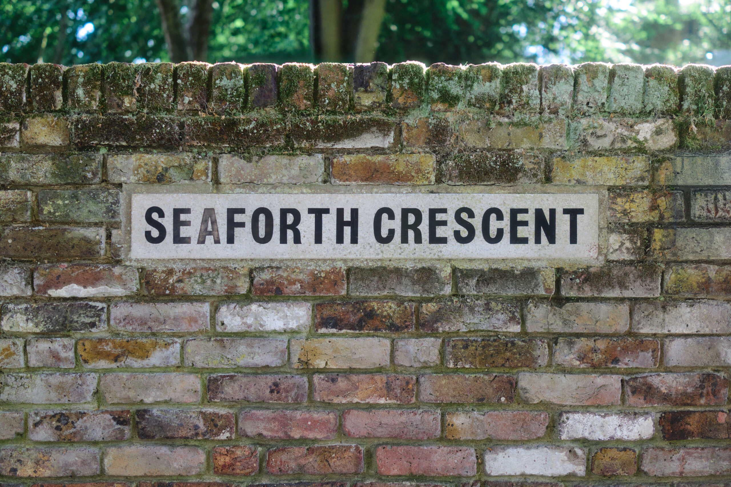
Set into the Wall Seaforth Crescent, and the last pair of hands in the chain.
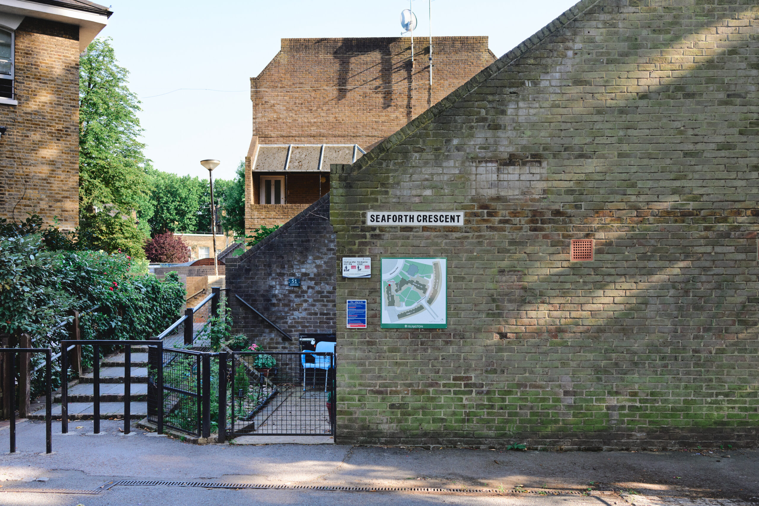
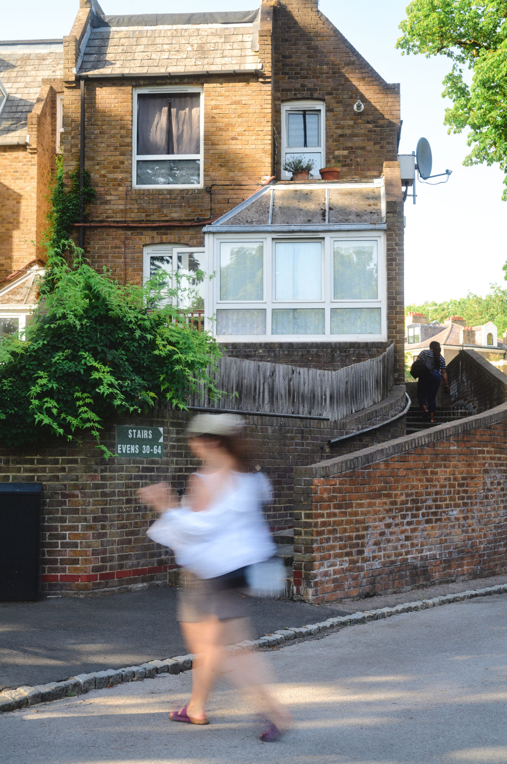
Seaforth Crescent is an easy-to-miss enclave of social housing in Highbury, tucked between two residential roads. Darbourne and Darke designed it, the practice behind Lillington Gardens in Pimlico, and it shares that scheme’s taste for meandering, planted routes. It is a lovely place to know and a genuinely confusing one to arrive at: the house numbers spread across terraces and raised walkways in a way that defeats satellite navigation, so deliveries go astray and, more seriously, emergency services can lose their way.
An Islington councillor set out to put this right, and the commission travelled a fair distance before it reached us. It began with designers Roy Coupland and Ya Ya Chen of RC/YYC, working alongside Neil Shasore, whose research in the local archives shaped the scheme. It passed to Solus, who supplied the earthy green and white terrazzo that settled the design. It arrived, finally, at Arcitile, to be cut into the brick. Every step of that route ran on trust, and we are conscious of what it means to be the last pair of hands to touch the work.
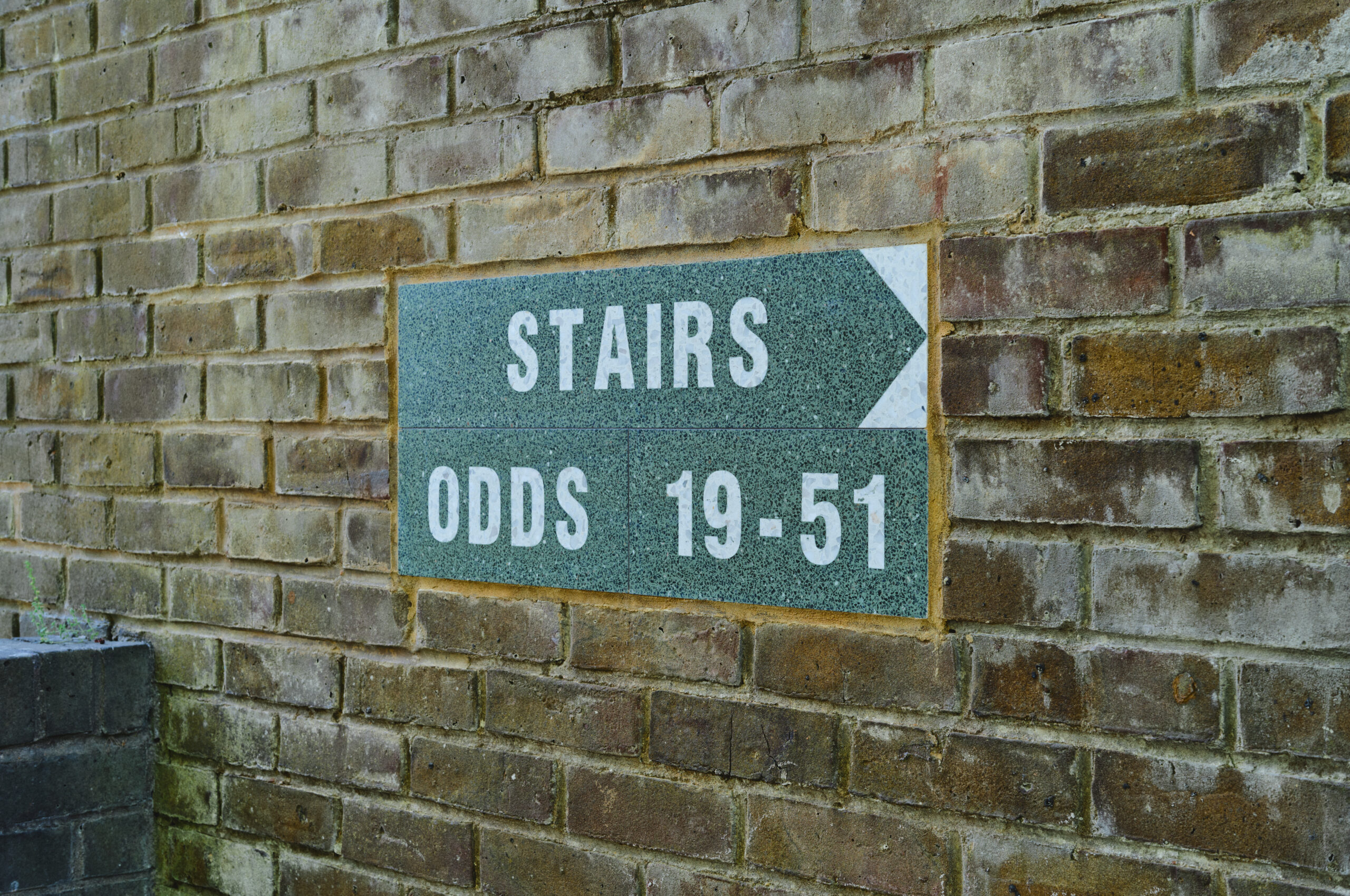
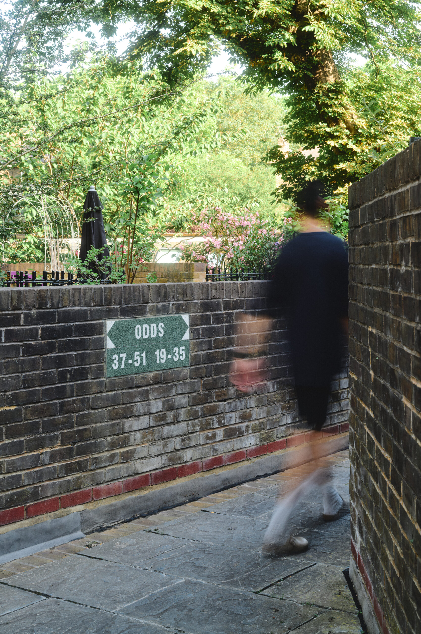
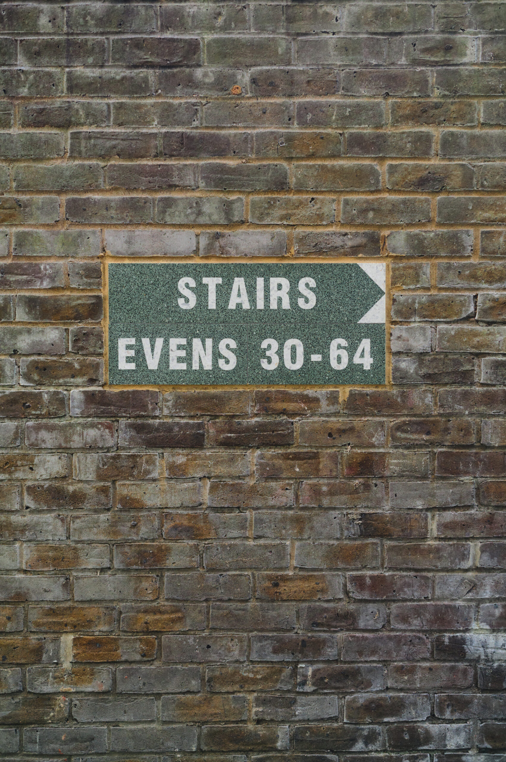
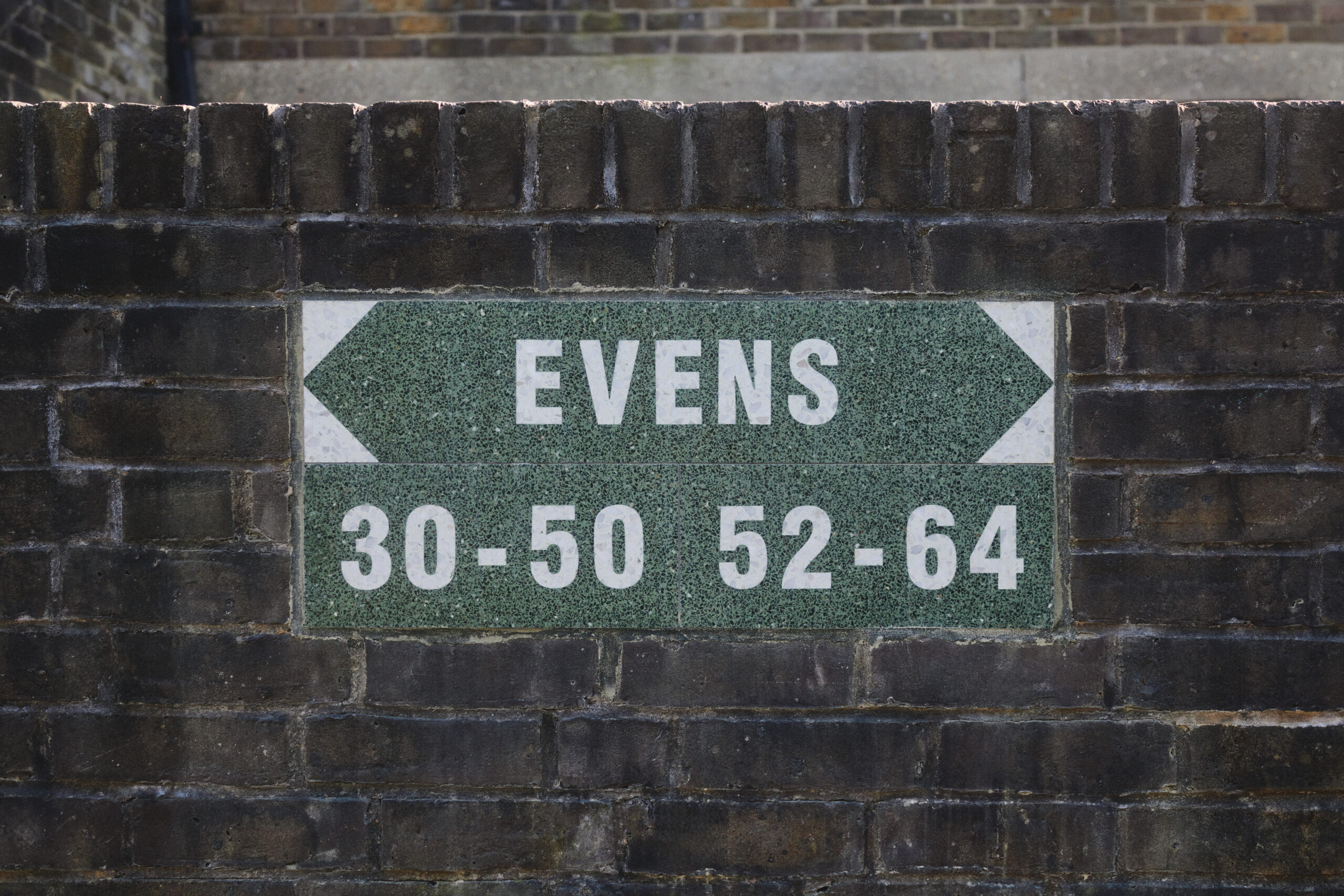
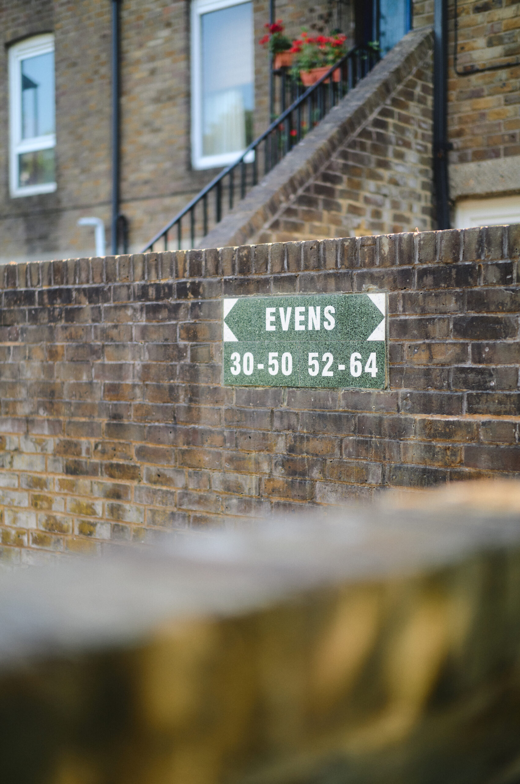
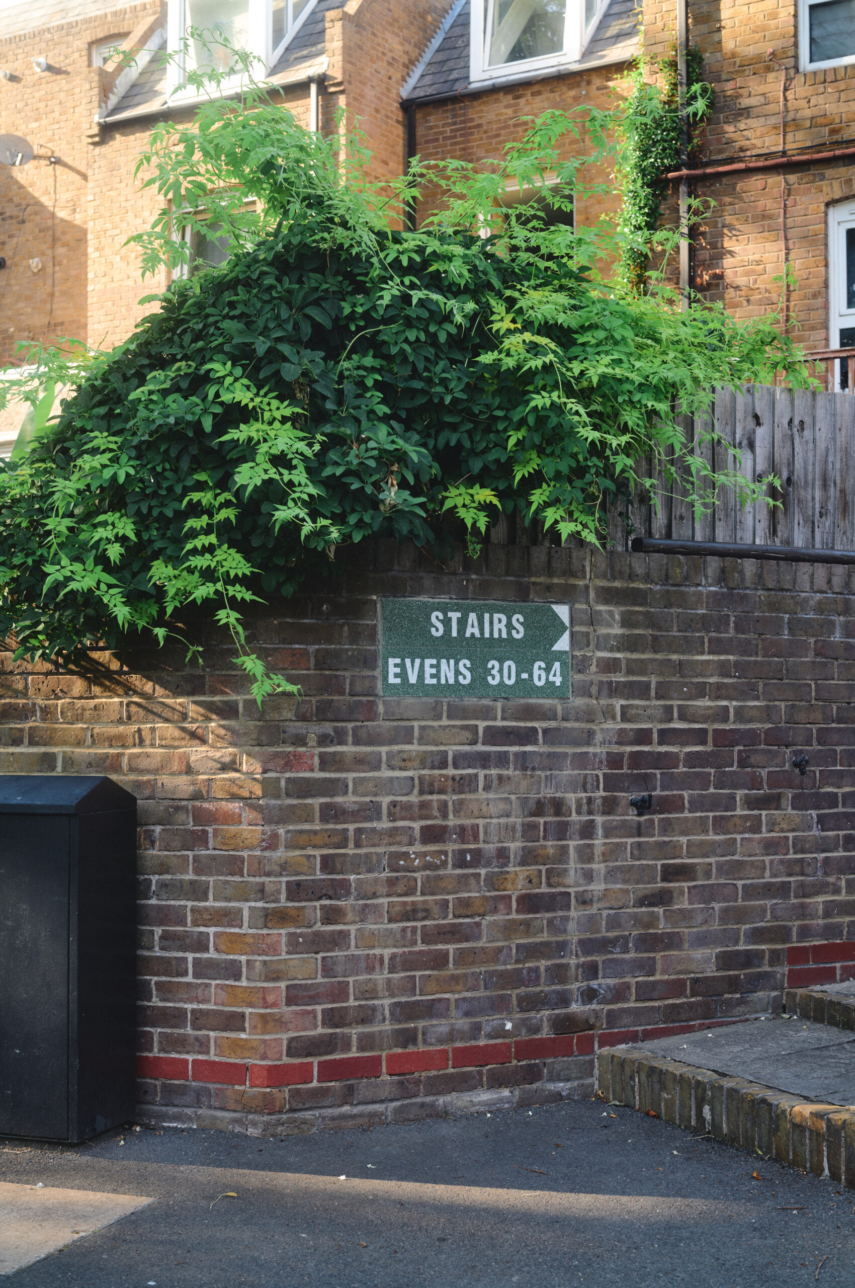
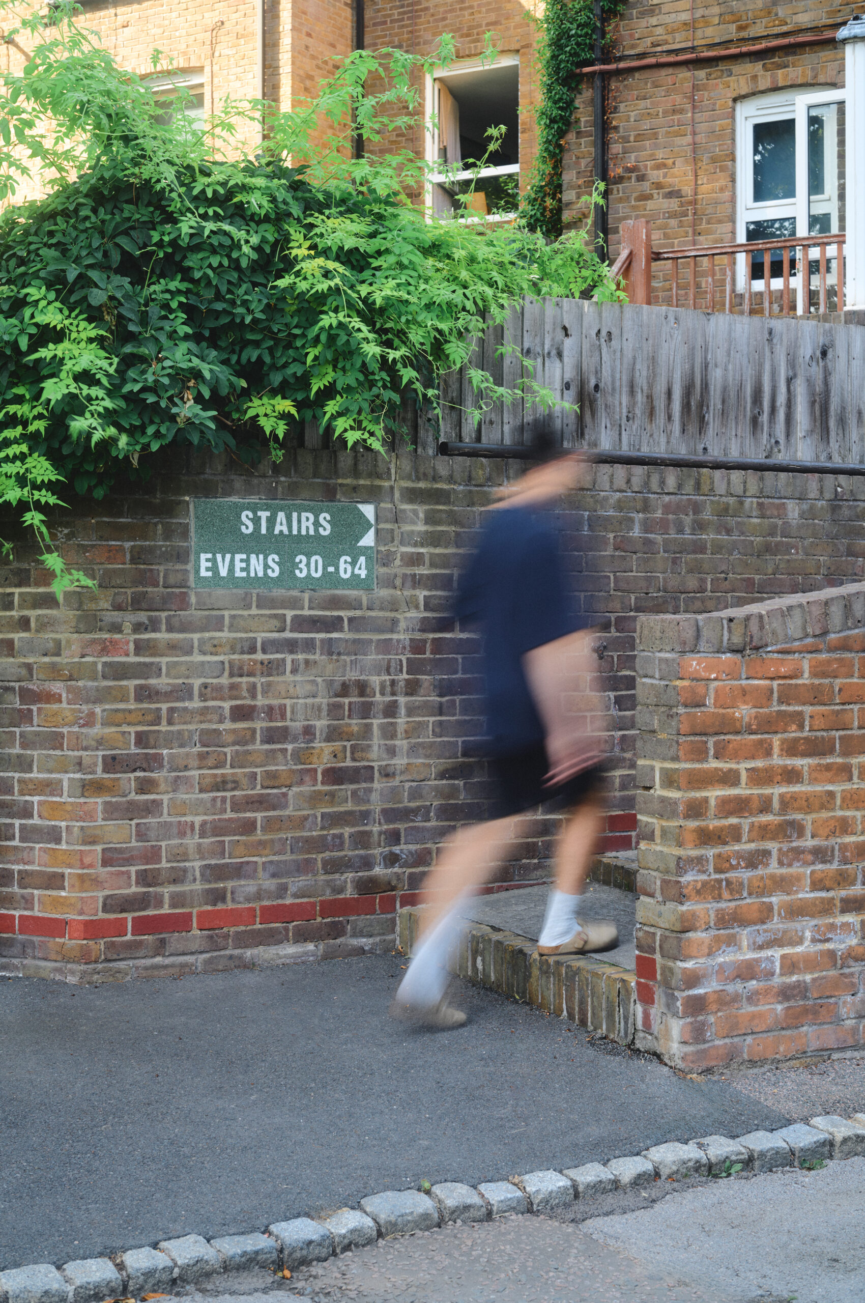
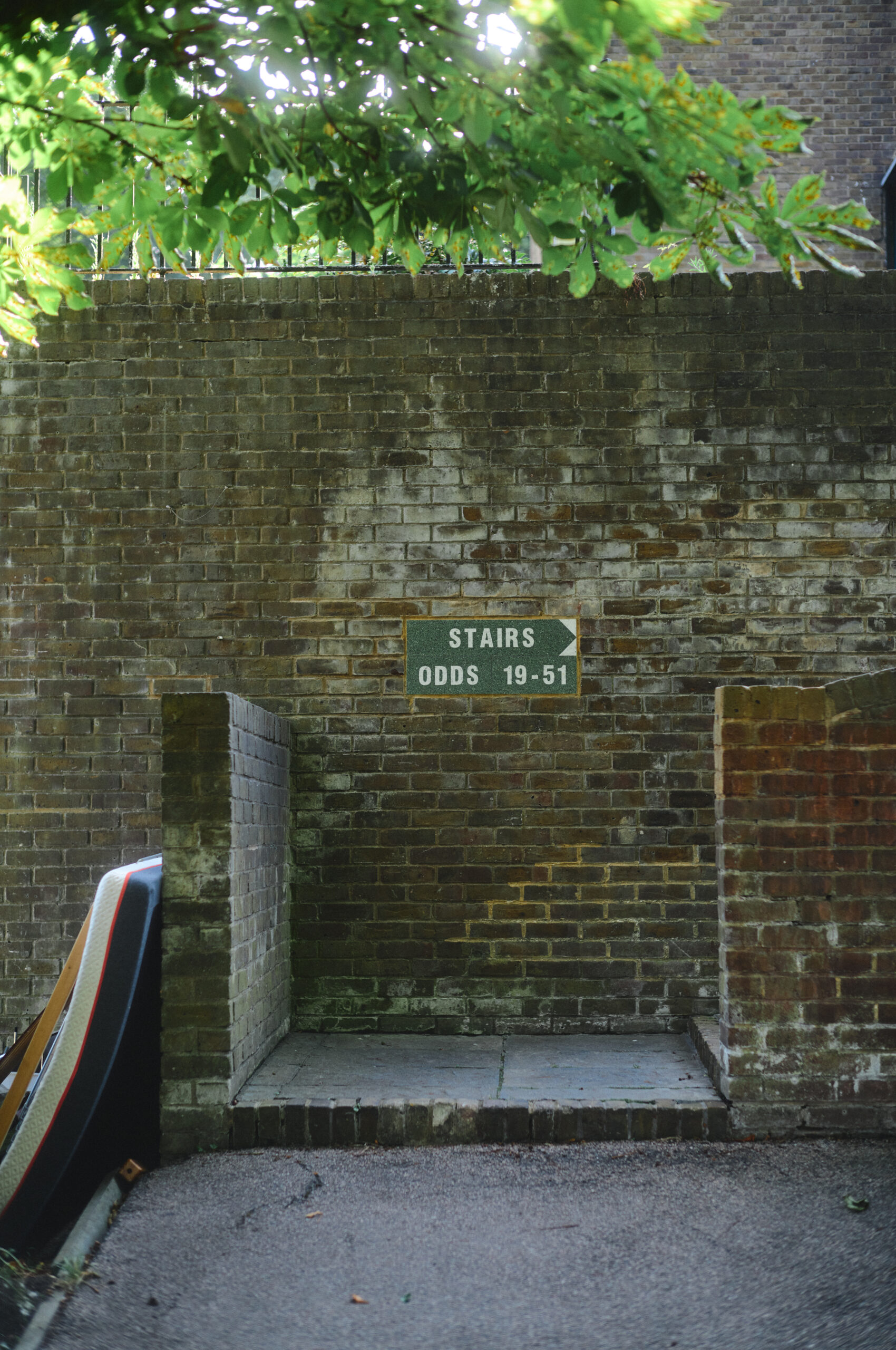
The designers had chosen to read the language already present on the estate. Darbourne and Darke marked its three entrances with reconstituted-stone tablets set into the wall, and Coupland and Chen took these as their reference: they cleared away the redundant later signage, kept the original lettering, and worked with colour and material. Our part was to honour that decision in the fabric. Most signage is clipped to posts and railings, or pinioned to walls; we set these signs directly into the weathered London stock brickwork, four courses high, exactly as the originals had been. That meant cutting into existing walls, grinding out the recesses, and setting the signs flush.
Coupland put the moment we care about most into his own words. “There’s a point in any project where the designer hands over to the maker, and it can be tricky,” he said. “We try to treat it as a chance to gain expertise and certainty rather than lose authorship, and that approach was met by everyone: Islington, Solus and Arcitile.” Understanding the intent fully, then building precisely that, is the whole of the job.
Installed, the tiles do what they should. The green sits easily against aged brick, moss and foliage, so the signs are sympathetic with the architecture and garden, while the white lettering stays legible right across the estate. A slender finger post at the entrance carries the same restraint, its arrows formed from small triangles. An older estate has been made findable again, using nothing disposable and a ceramic likely to outlast any printed sign. For a firm based in Islington, a few streets from the work, that’s a happy outcome.
“Not everything worth doing well pays well. This was a small order that mattered enormously to the people who live there, and to anyone who has to reach them in a hurry. That is the kind of work we want our name on: useful, made to last, done properly.” Dan Evans, Arcitile.
Project Details
Location
Seaforth Crescent, Islington
Status
Completed
Year
2026
Services
Bespoke Fabrication
Site Survey
Project Planning
Restoration
Stone Masonry
Architect
Roy Coupland
Ya Ya Chen
RC/YYC Practice
Collaborators
Solus
Islington Council
Neil Shasore
Photography
Shin Miura