A unit of information: in the studio with Paul J Marks
A Space Between
with Paul J Marks
Date
July 2026
Location
Clerkenwell, London
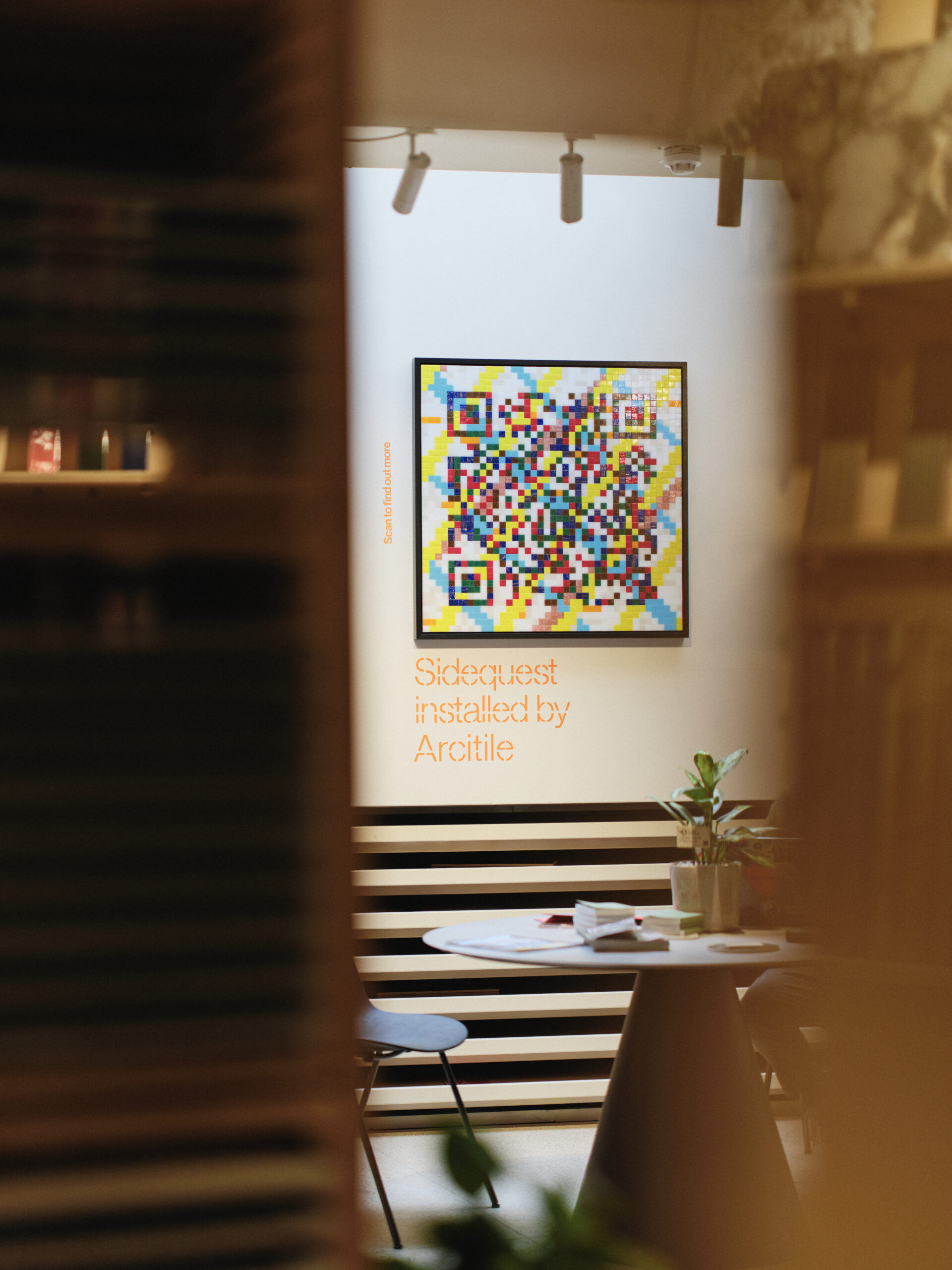
The mosaicist behind Arcitile’s Clerkenwell Design Week QR code talks tesserae as data, the colour he avoids, and why he is happily constrained by commission.
There is a particular pleasure in meeting someone who has thought, properly and for decades, about a single idea. For Paul J Marks the idea is the fragment: the tessera, the pixel, the small thing that means nothing alone and everything in company. It is the logic of the mosaic, but Marks has carried it well beyond the floor and the wall. It runs through his paintings, his theory of colour, even his sense of how the world is assembled.
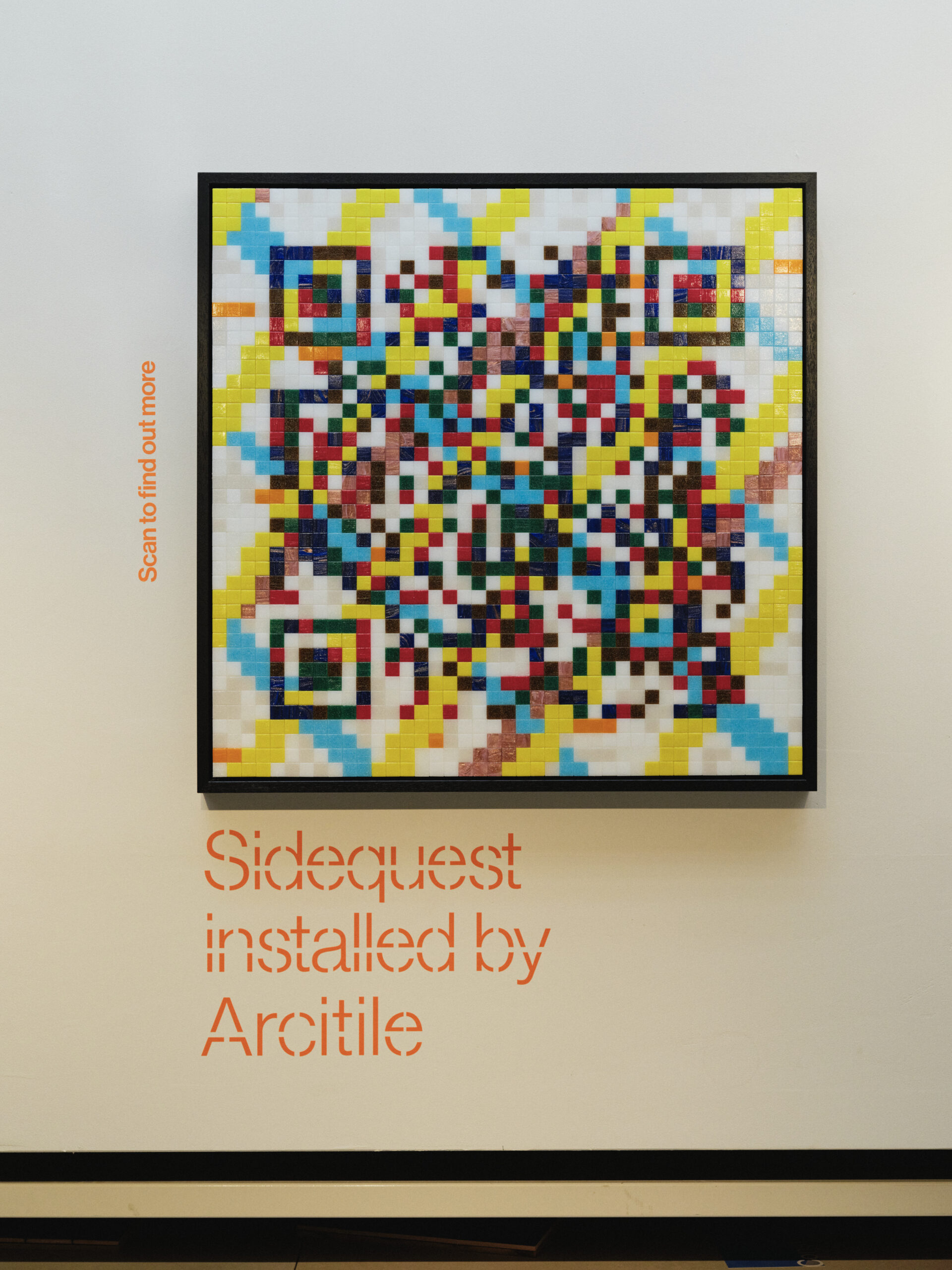
We spoke shortly after his collaboration with Arcitile on a mosaic QR code, produced under real pressure for Clerkenwell Design Week. It is a neat emblem of the man: an ancient craft pressed into the service of a thoroughly modern, machine-readable image, and made to work. What follows is an edited account of that conversation.
From the showroom floor
Marks did not arrive at mosaic through the gallery. He arrived through the trade, which is to say through his father.
“My background is the architectural construction side. My father was a tile contractor running a similar service to Dan, from the 1960s, with a retail showroom as well. I came into mosaic from that end.”
He set up his own studio in 1990, as his father was retiring, and made an early, clear-eyed decision about where a living was to be found. “I felt that the architectural market was really the only possibility of me working in the mosaic field at any sort of creative level, and earning a living. So that’s where it started. Over the years I’ve blurred the edges a little bit.”
That blurring is deliberate, and it is the key to his practice. Marks keeps architectural and artistic work in the same hands without letting either crowd the other out. The commission, far from being a constraint he tolerates, is closer to a collaborator.
“The service I offer for the architectural market is primarily on a commission basis. Rather than being dictatorial in design terms, working collaboratively with architects and designers can take your work in new directions that I wouldn’t have thought of as an artist. It presents its own challenges, but it’s actually quite rewarding. I don’t feel my artistic toes are being trodden on. There is always merit in a good commission.”
"My background is the architectural construction side. My father was a tile contractor running a similar service to Dan, from the 1960s"
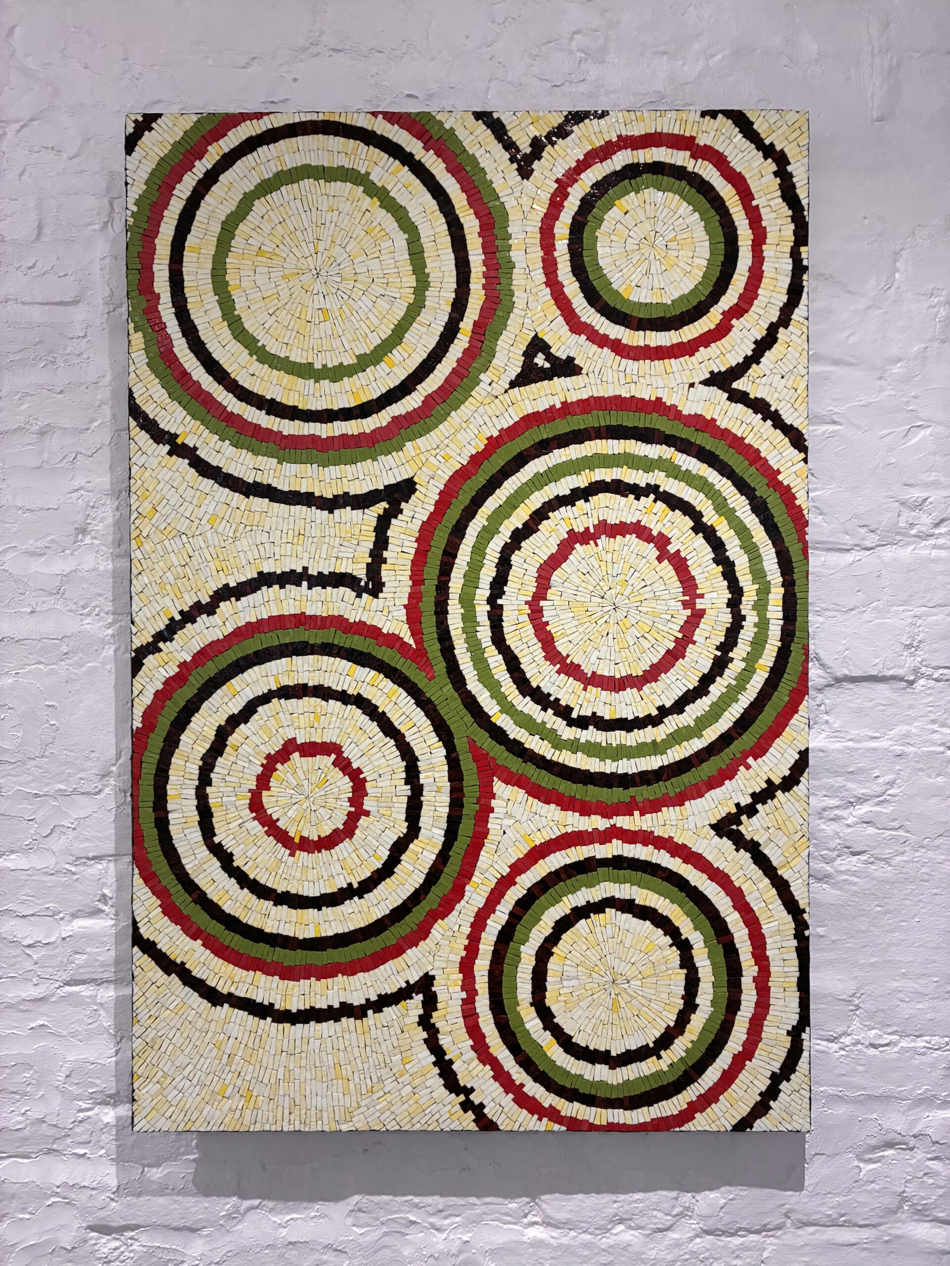
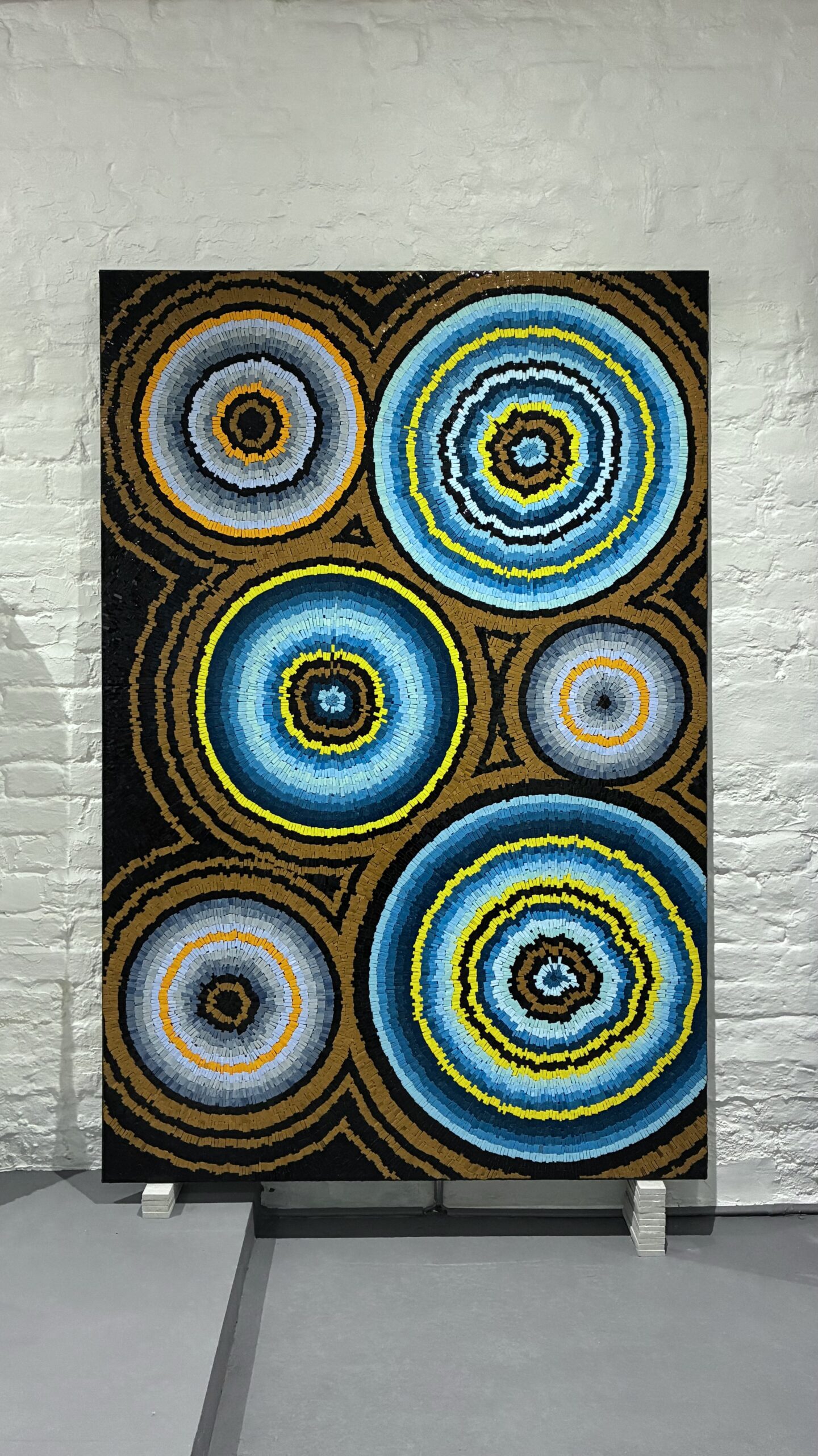
In defence of the patronIn defence of the patron
It is a refreshingly unromantic position, and Marks roots it in history. He read the early Renaissance painters during his degree at Camberwell, and found the supposedly pure artists of the period working to contracts as tight as any modern fit-out.
“It was quite early in my studies, looking at people like Piero della Francesca, that I became aware these guys worked strictly to contracts. The Medici families and the religious entities would stipulate percentages of gold paint to be used, percentages of rare minerals like lapis lazuli. They were bolted down in quite strict contractual terms. That came as an enlightening moment: these fabulous works of art that we all take for granted were works by commercial studios, really bolted down, and yet the art still comes through. It’s possible.”
The same discipline shaped the Arcitile QR code. Dan Evans supplied a coloured QR image; Marks had to translate it into glass that was both available and tonally correct, with no second attempt and a Design Week deadline bearing down.
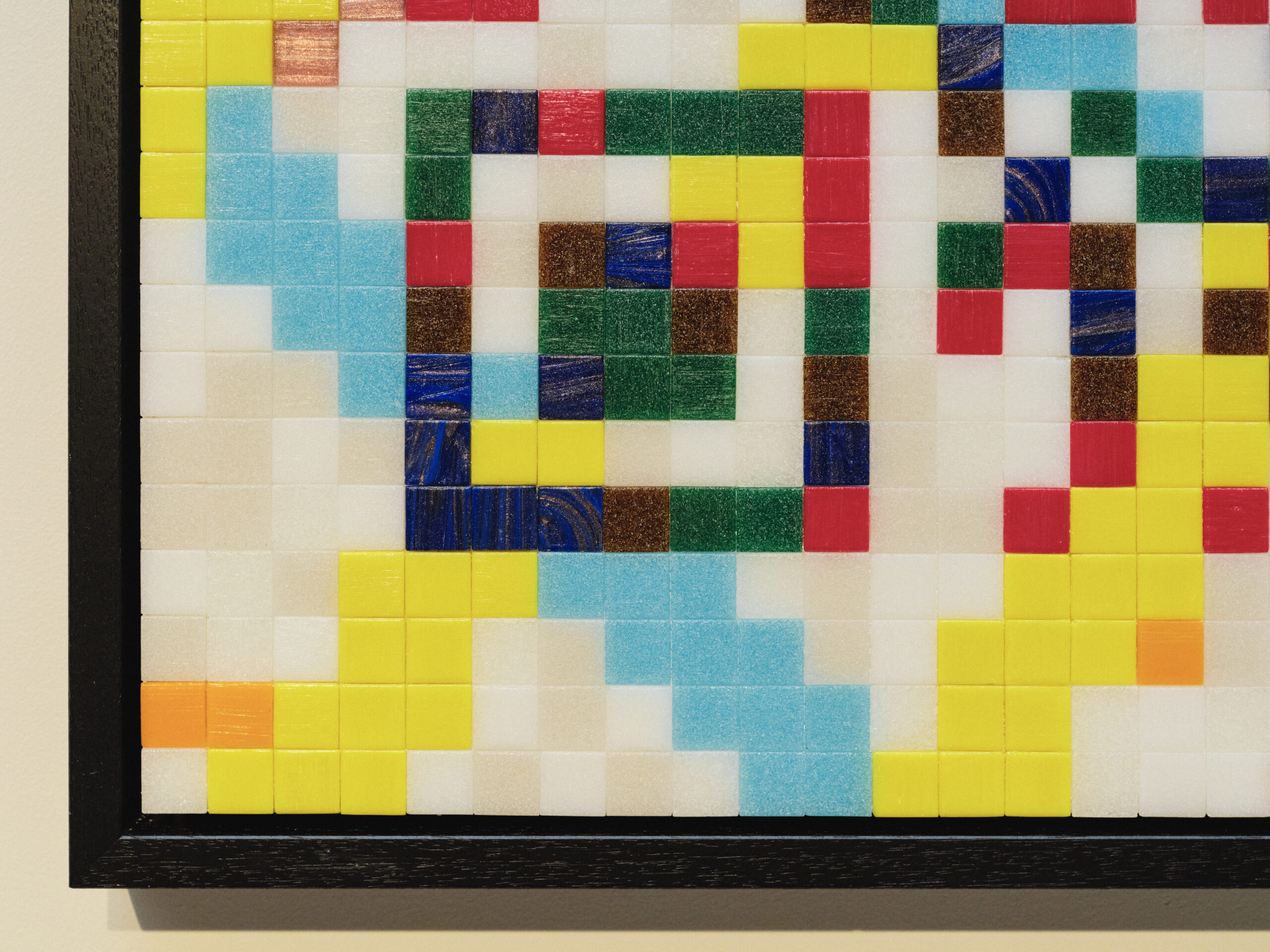
“Translating those colours into the actual glass format required me choosing colours that were both available and felt they’d give the right tonal contrast. Until I’d actually put the thing together, I didn’t know whether it would work. Time was really tight. So it was a case of, okay, I’ve got one shot at this, here’s the material, will it work? And there was a moment at the end of, yes, it is right. I was quite relieved. The colours seemed to work, everyone seemed to like it, so that was all good.”
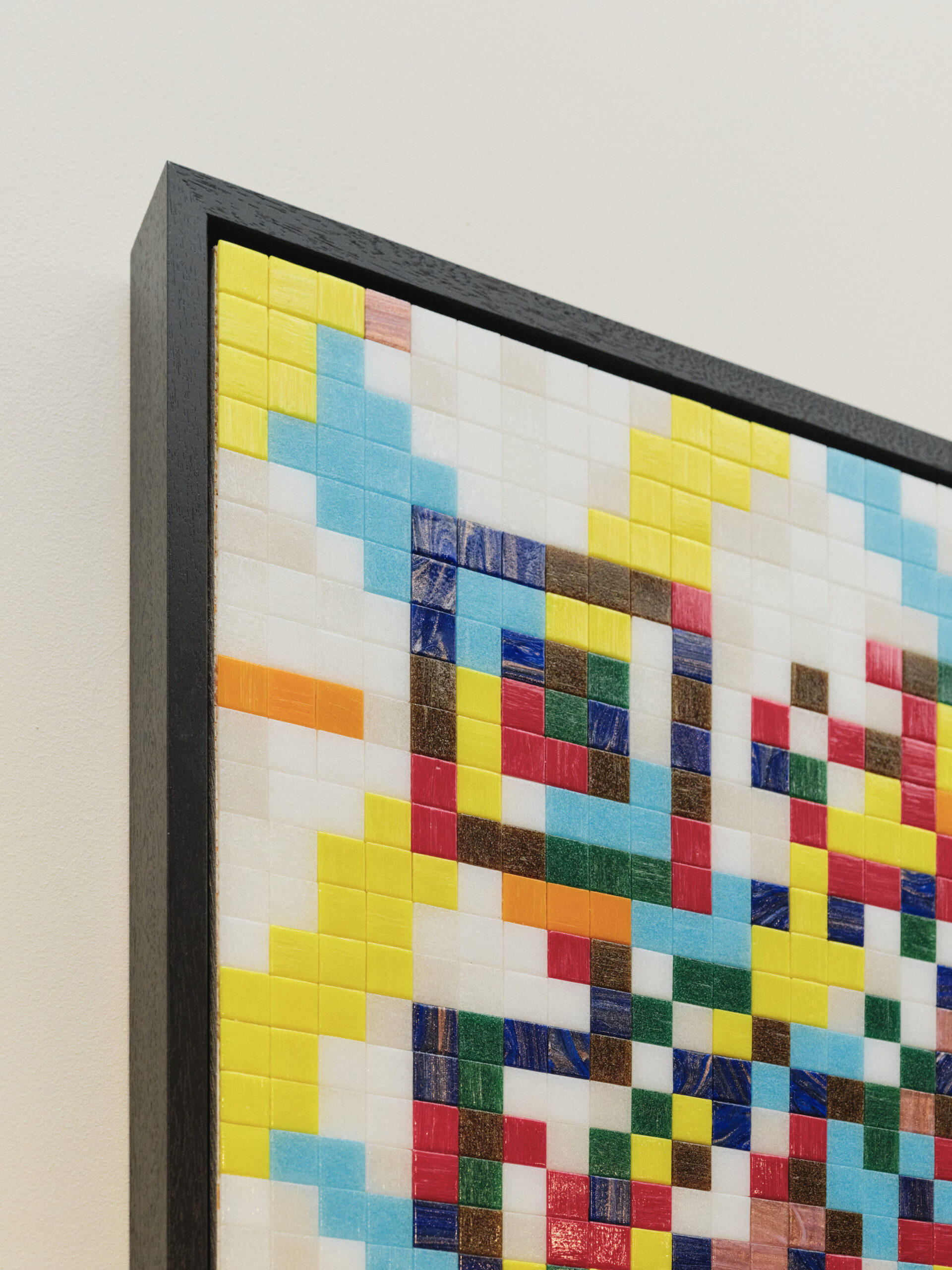
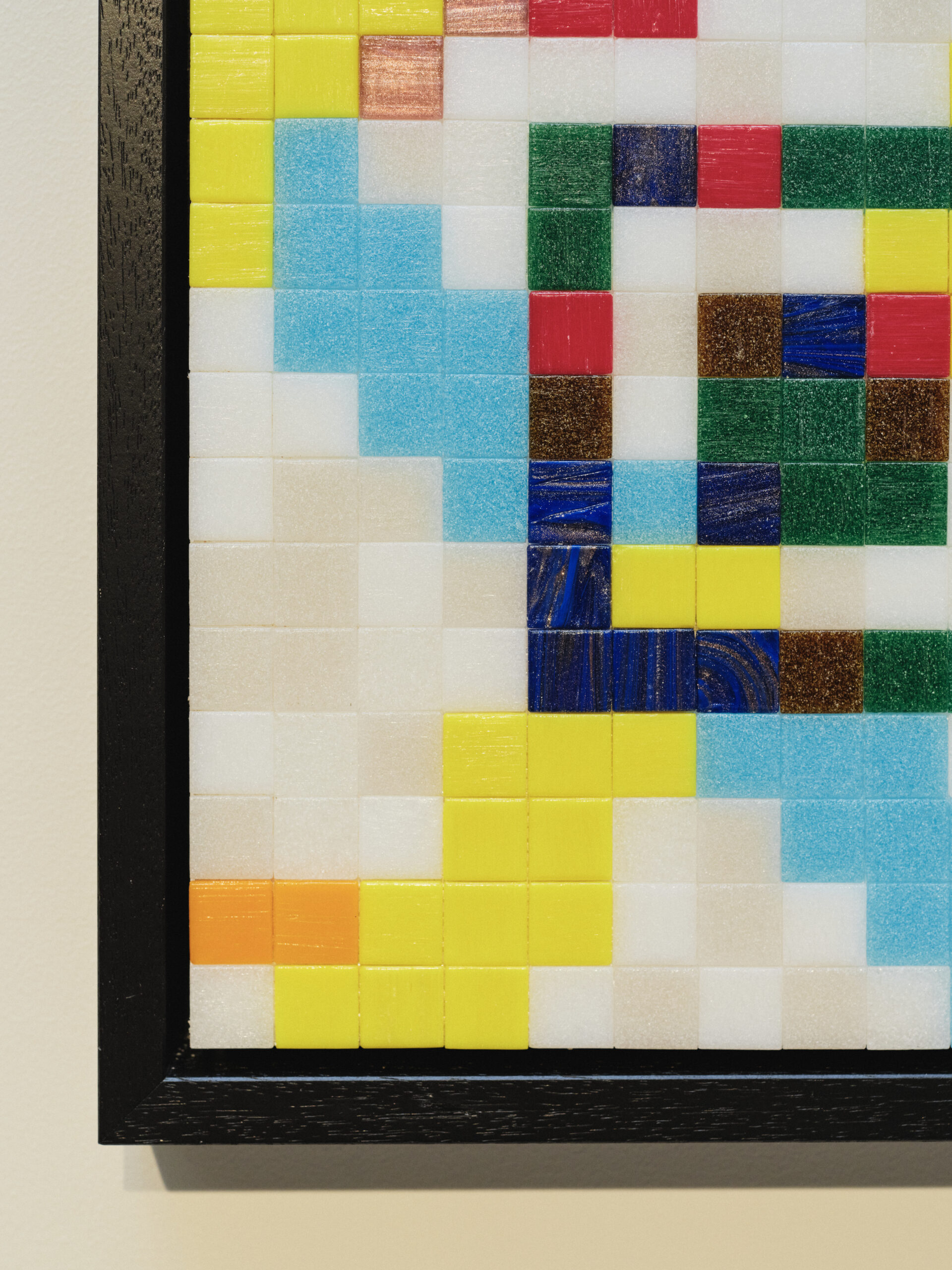
"My theory on colour is fairly simple. Colour is a great way to convey emotion"
The colour he avoidsThe colour he avoids
Marks talks about colour the way other people talk about weather: as something that acts on us whether we consent to it or not.
“My theory on colour is fairly simple. Colour is a great way to convey emotion. The guy who really embodies that for me has always been Mark Rothko. With his later works it’s best not to think, but just feel. That’s the colour field working on you.”
He also has a blind spot, freely admitted and unexplained. “One colour I find really difficult to use is green. It was a long time before I realised I rarely use green in my work. I’m not a hundred per cent sure why that is. It just is.”
In his Shift and Multiverse series the colour was allowed to find its own way. “I didn’t have any premeditated idea of what the colour field was going to be. I just chose a colour to start, and every subsequent colour was literally aresponse to the first. That freedom of not being prescriptive was quite a nice way to work.”
Old ways of seeing, new tools
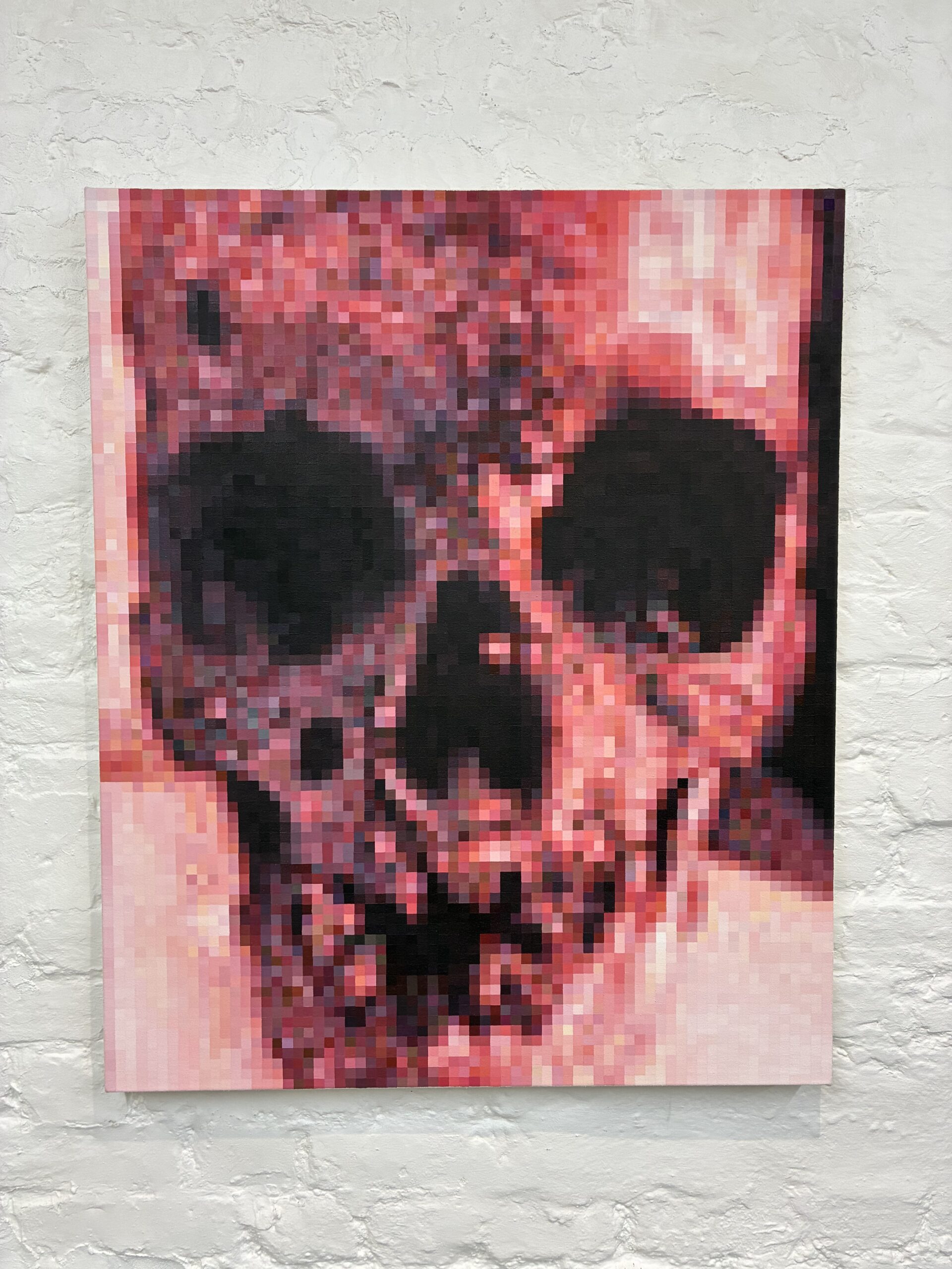
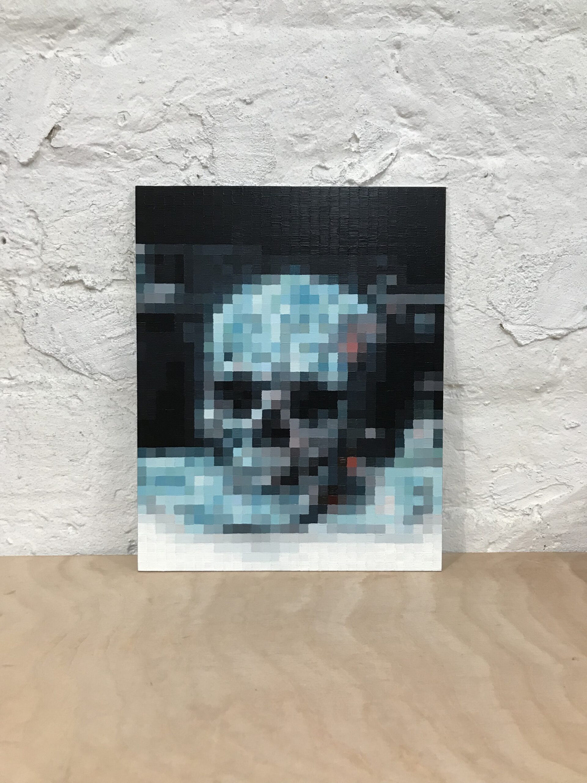
His paintings work in the opposite direction: rigidly, pixel by pixel. “They are effectively pixelated paintings. I generate an image using Photoshop, then when I paint I have my laptop or a tablet next to the painting and I’m transposing a pixel for a painted square.”
Painting with a screen at his elbow is less novel than it sounds. Artists have always reached for the optical technology of their day. As the late David Hockney argued, the old masters used the camera obscura and the camera lucida to project the world onto the panel before they committed it to paint; Vermeer may have worked from the image in a darkened box. New ways of seeing and new ways of making arrive together, the lens and the brush advancing in step. Marks simply has a screen where Vermeer had his box.
For Marks, this realisation occured around 1995, the first time he sat in front of a computer.
“It had a free version of photo-editing software. That was the first time I’d confronted bitmap imagery. Instantly my mind went to: well, this is a mosaic. A tessera is a piece of information, and when you put all those pieces togetheryou get a representation. That’s what bitmap imagery is. So this link between imagery and information came together. My paintings head that way, my mosaics head that way. You could say the Greco-Roman period is where pixelation started.”
Everything made of smaller things
This instinct has a philosophical underpinning: a passage from the Hungarian-born theorist György Kepes that Marks first encountered during an MA in drawing in the mid-2000s is worth quoting:
Indeed, we nowadays regard all the world as built out of certain subatomic fundamental modules, or particles, whose classes we are still enumerating. Why they are precisely identical by classes we know not. They seem to occur in families, as the tiles of a mosaic, grouped not by colour but by sets of other intrinsic properties. They interact with each other in ways which are complex, but which themselves reflect a complex set of essentially discrete rules. Out of all this tangled skein time has woven the fabric of the world.
(Phillip Morrison, Module, Symmetry, Proportion. Edited by Gyorgy Kepes. London; Studio Vista, 1966 p1)
“It struck me as very beautiful. Beyond it being a seemingly dry, complex sentence, there was something in it that felt like it was written for how I feel, because of my family history with tiles and mosaics. That’s how I think everything is made of smaller things. Nothing is a whole in itself; everything comes together from constituent parts that interact to create a thing.”
He traces the habit of mind back to childhood. “It’s an obsession from being a child with jigsaw puzzles, Lego kits, Airfix kits. Those were my major toys. So progressing into mosaics, I’m creating the puzzle and creating the picture.” The word he settles on is interdependence. “So often now people try to make things stand alone, particularly in politics. But there is no such thing. It’s an interdependent world. Embracing that, rather than separating things and believing they stand alone, makes everything make more sense.”
The mosaicist who sees the world as a set of small parts in conversation is content, himself, to be one of them.
A return, twenty years on
For all his ease with the commission, Marks is beginning something of his own. A new mosaic series, as yet unnamed, has just left the starting blocks. It grows out of Shift and Multiverse, the latter itself born of an open-brief commission for a since-vanished restaurant on Gloucester Road that remains his favourite piece.
“It’s the first time in nearly twenty years I’ve gone down that road. It’ll be slow, fitted around the commissions. But I’m excited, and I hope it may expand into some commission pieces as well.”
He is candid about why the work, not the spotlight, is the point. “I’m not great at self-promotion. Exhibitions make me very anxious, the social aspect of it. I’ve actually withdrawn from exhibiting, maybe six or seven years now. I have an Instagram profile, that’s my only social media. I’m just quite happy working away, doing my thing, and it goes where it goes.”
It is a fitting note to end on. The mosaicist who sees the world as a set of small parts in conversation is content, himself, to be one of them: head down, colours responding to colours, the picture assembling itself a tessera at a time.